I’m back this post to talk about some of the choices that went into the cover design of the Land Mysteries books. As is visible, they take a different direction in some ways from my 1920s books. There are also a number of details you might not have spotted that I’ve been wanting to highlight!
One note that this post contains spoilers for key moments in the books (since that’s relevant to what’s on the cover). I’m avoiding talking about details here, as much as feasible. But if you want to avoid all spoilers, go have fun reading and come back when you’ve read the relevant books!
Overall
When Augusta and I started talking about the covers for these, we kicked around a number of different approaches. What we came down to, eventually, was that these books are especially rooted in both time and place, in specific ways. That was true for every book in the series, though sometimes from varying directions.
(Thesan, of course, approves of both chronological and locational points of interest.)
The basic design
What we chose was a map – a specific map for each book – and a moment in time – represented by an astrological chart. I floated it as an idea when I was working on Best Foot Forward, where the chart for that event is actually discussed in the text. But it worked for every book in the series! And we were pretty sure we could sort out relevant maps from available sources (that were out of copyright and covered the right areas).
The Figures
As with all my books since my first series, the figures on each book are generated using a 3D modelling program. Augusta then overpaints to adjust any details. This allows us to get wonderfully specific about position, body type, and other details.
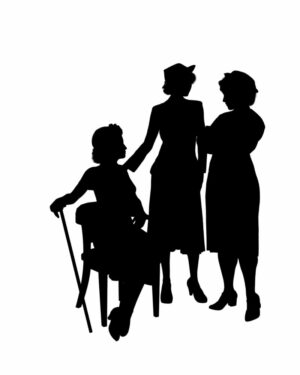
Here’s the test image of the figures for Three Graces. Alysoun’s sitting at the left, her cane visible. (And being Alysoun, she’s sitting entirely properly and formally, her ankles together and at an angle.) Lizzie’s standing in the middle, with a sharp hat. Thesan’s a bit broader shouldered, and she’s a little less on the edge of fashion.
Augusta came up with a palette of WW2 era colours, and off we went!
Best Foot Forward
To illustrate the series, I want to talk a bit about a range of details here, then I can be briefer with the later books. Each title in this series has three key elements: the map, the chart, and the figures.
The map
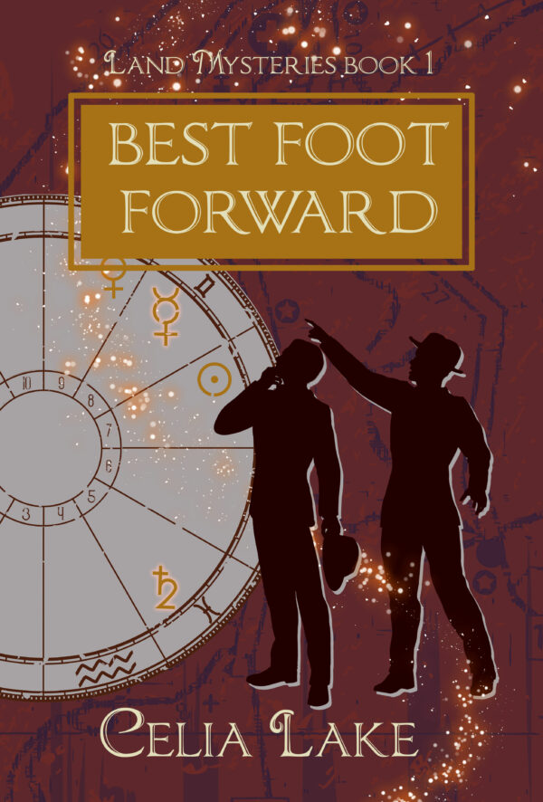
The map in each book represents a specific location. For Best Foot Forward, it’s the area around Berlin, Germany, where a significant portion of the book takes place. Augusta found images that would work for each map, from a close enough time period. (We don’t want any modern highways or more recent construction popping up!)
The chart
The twining of astronomy and astrology is a complicated topic – for centuries, they were the same thing. Albion has kept the various uses of astrology for magical use, in a wide range of methods including ritual timing, certain materia harvesting or preparation, and more. (Check out my public Patreon post from June 2024 about this in more detail.)
Here’s what Alexander and Carillon say about this chart, when they discuss it, as part of their plans for a magical renaming. Carillon’s just handed over a chart and mentioned it wasn’t done by Thesan, but by someone else.
The chart was neatly drawn. Spare, not fussing about with asteroids, just the seven principle planets and a handful of the fixed stars. “It’s not ideal, but needs must.” Besides, astrological timing was almost never uniformly ideal. It was instead a question of where you bent and bowed or kept a watchful eye.
He tapped his fingers, looking at the alignments. “That Saturn placement stands out, but the trine to Jupiter and Venus gives me some ideas for structuring the rite. Working against the challenge from the square to the Moon and Mercury. What’s his nature?”
“Not nearly so mercurial as I. I’d look to the Mars placement. Not warlike, but seeking the competition, wanting to be first with an idea made real. He’s never been purely theoretical, that’s the good and bad of it.”
Alexander nodded and grunted. “I can make this work. Assuming the binding is something I can manage, which I won’t know until I meet him. I’ll need a bit more time with it.”
Best Foot Forward, chapter 29
What a chart looks like
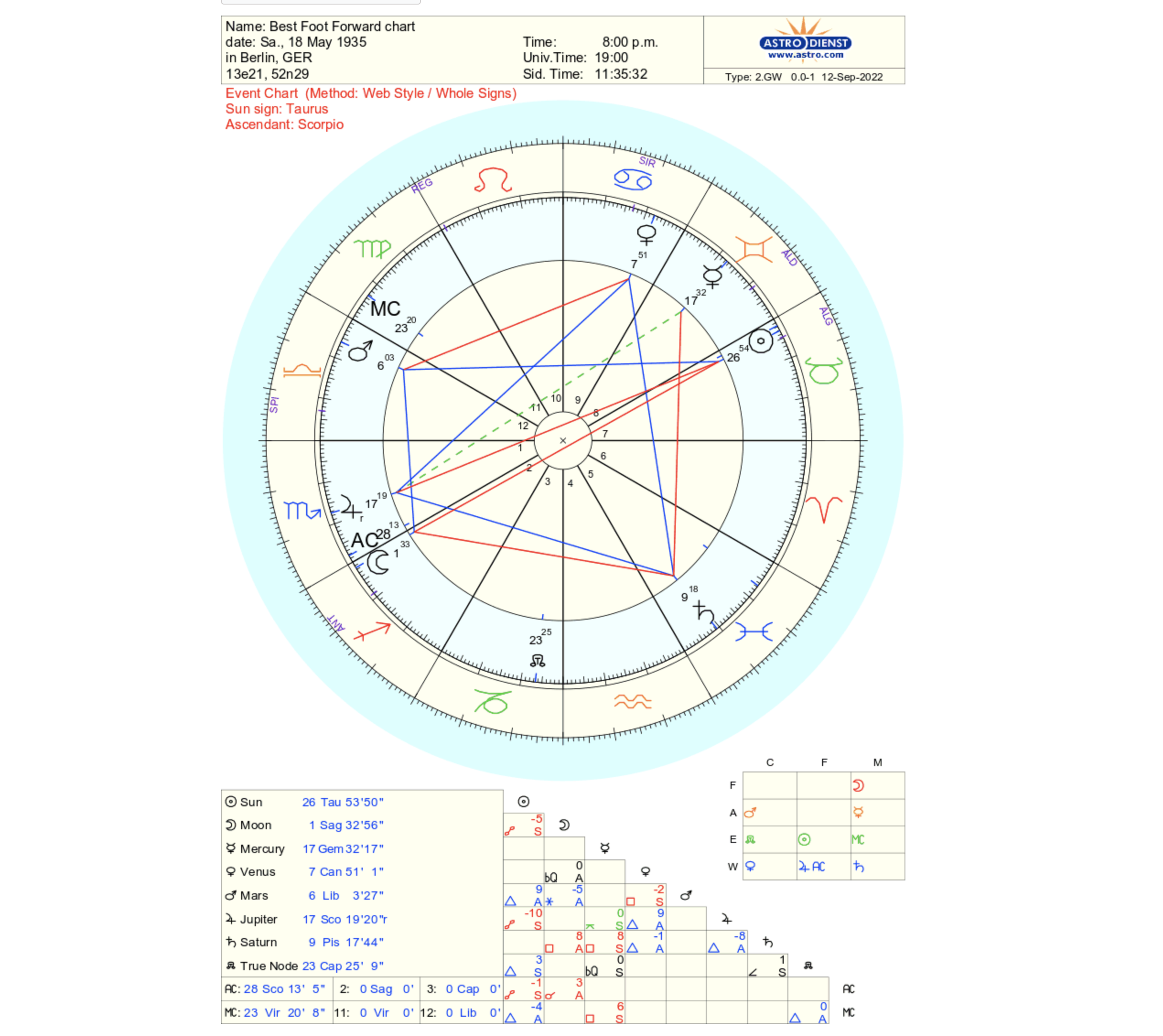
Here’s the chart I sent to Augusta to work with. I pulled it together from Asto.com, one of the venerable sources for such things.
It’s set for May 18th, 1935 in Berlin, Germany. Saturn is the thing that looks like an H with a line through the stem in the bottom right quadrant, Jupiter’s symbol looks like a 4 (between 8 and 9 on the clock face). Venus is the women’s symbol of a circle with a stem and a horizontal line for arms (around 2 o’clock on the face).
Without getting into too much detail here, blue lines indicate lines of ease and good relationship, red lines are more challenge. (And the fact that Venus, Jupiter, and Saturn make a visible triangle means they’re all in good relationship to each other.) The thing to know about astrology when it comes to “when do I do this thing?” (what’s called electional astrology) is that there’s basically never a perfect time. It’s always a trade-off.
Each chart is divided into 12 houses, those are the things numbered 1 (starting at 9 o’clock on the clockface) and moving counter clockwise around to 12. The houses do have all sorts of implications in reading or interpreting a chart, but I’m not getting into that here. Each house is also associated with a specific zodiac sign depending on when the chart ‘starts’ (the rising or ascendant). The little tiny letters around the outer edge indicate fixed stars (more about that below).
The chart on the cover
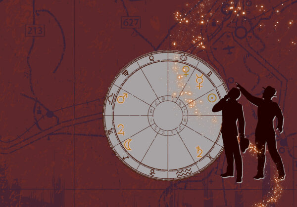
From here, Augusta took the seven planets and set up the chart on the cover. She asked me which planets were particularly relevant. Here, I picked the ones they discuss (Jupiter, the Moon, Saturn, Mercury, and Mars, going counter-clockwise from 9pm on a clock-face.) On the ebooks, you can’t see the full cover or chart, of course! Some things are hidden.
The figures
Here we have Geoffrey and Alexander, both engaged in and curious about something. I love the way they’re mirroring each other’s position here.
Nocturnal Quarry
Time and place
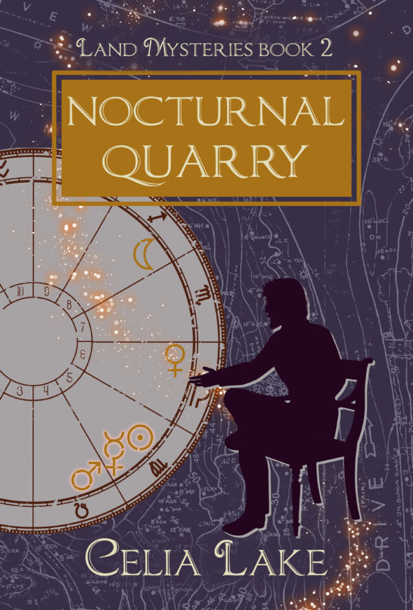
In Nocturnal Quarry, Alexander is travelling up and down America’s East Coast, but a lot of the key interactions take place in New York City. That’s the map.
The chart is for August 31st, 1938, which is his conversation with Margot. When I was looking at various possible dates to see what might be amusing, I hit on this date. My conversation with Kiya included the comment “There’s a Mars/Mercury/Sun thing, which is very ‘I am going to talk to you extremely aggressively now.’ which is accurate.”
Those three planets are all almost on top of each other in the chart, a conjunction. We spaced them out here a little for legibility. The Sun is a planet in astrological terms, it’s been like that for century on century.
Also interesting
What’s not on the cover is that Regulus, one of the ‘fixed stars’ which is associated with someone stepping into their sovereignty, and can also help battle depression, making the person so affected magnanimous, brave, civil, and even-tempered. Given Alexander’s various experiences in this book, that turns out pretty well for him.
(Fixed stars are what most people just call stars, as opposed to ‘wandering stars’ which are the planets. Again, standard terminology in the field for centuries. Fixed stars don’t appear to change places in the sky, at least not on anything like a human timeframe.)
Figure
We both loved Alexander sitting, gesturing and talking. He’s relaxed but also engaged. You can decide yourself which of the conversations in the book this is, but I often think of him talking to his aunt.
Old As The Hills
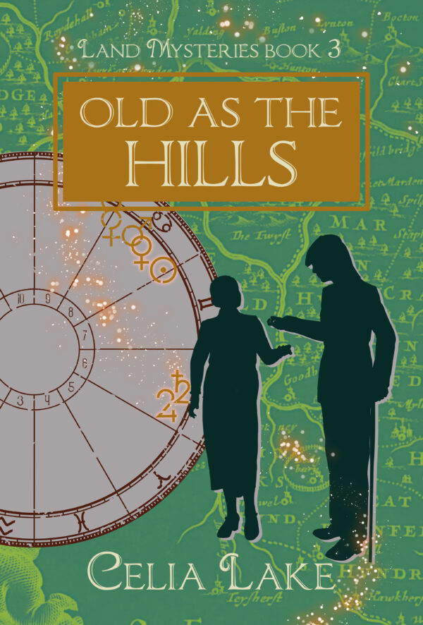
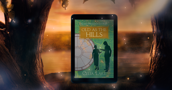
In Old As The Hills, we have two key characters again, Gabe and Rathna. They’ve been married for years, so we had a number of choices for position. We did this cover and Upon A Summer’s Day at the same time, so we knew Gabe would be on the cover of that. We also knew we wanted Gabe’s cane visible.
The first thing I love about this cover is the way they’re about to make the arch of a portal shape with their joined hands. (And knowing these two, Gabe’s contemplating something he’s just picked up, and Rathna is listening to him explain.)
Time and place
There were a lot of possible choices of map here! The book takes places in a number of different locations. In the end, Augusta and I settled on Kent, which let her do something lovely. See that splash of golden starlight between Gabe and Rathna? That’s just about where Veritas is, their home.
The date for this one is, of course, summer solstice 1940, a key date for both of them.
Upon A Summer’s Day
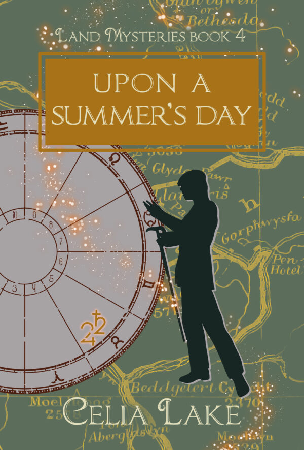
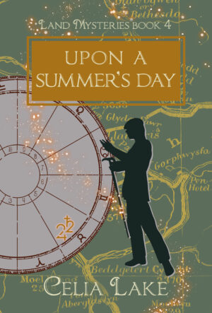
Upon A Summer’s Day actually has six point of view characters in a complex dance. (Gabe, Rathna, Alexander, Geoffrey, Richard, and Alysoun. But six is way too many people to fit on a cover. So here, we just have Gabe, gesturing and talking. I think of him here talking in the later half of the book when he is putting on a very specific educational show.
Time and place
The time for this one was easy: November 29th, 1940. Gabe’s challenge for the Council. That also gave us our map. He’s basically standing on the location for Dinas Emrys, the Council Keep in Wales. (Dinas Emrys is a real place, so you can go compare easily here!)
Colour choices
We went back and forth on the colour choices for this one a bit, finally settling on the two books (which form a duology within the larger series) being different shades of green. It took a little to figure out how to get them to both go together and be distinct enough.
Illusion of a Boar
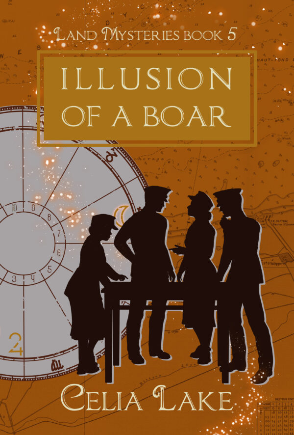
Illusion of a Boar has four point of view characters, and I absolutely wanted them all on the cover. They’re all working together on a secret project that’s key to the war effort. Here, from left to right, we have Cammie, Orion, Hypatia, and Claudio.
Augusta asked me if Hypatia and Orion should be holding hands here, and we went with them arguing. (Though after the point where Orion had figured out how to have arguments that worked better. Geeks, both of them, with passionate opinions.)
Time and place
The time for this chart is the D-Day invasion, June 6, 1944. The location, however – and the map – isn’t Normandy. It’s Calais, where the deception operation was doing its best to focus attention.
Three Graces
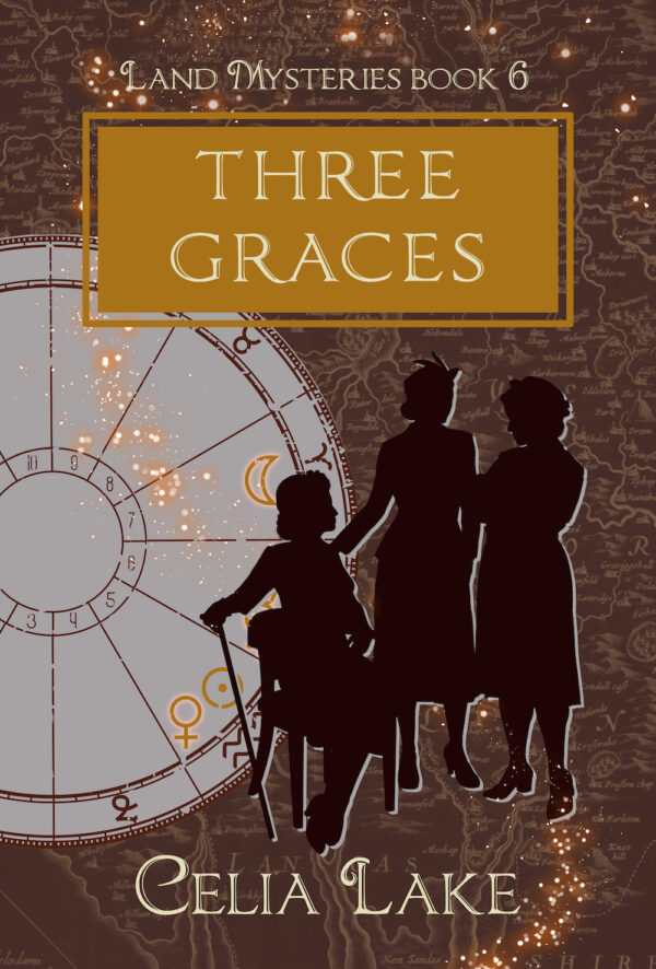
Three Graces has three point of view characters – Alysoun, Lizzie, and Thesan. As the war in Europe ends, and various of their family members are on the Continent to help as they can, they take on an old mystery. One that dates back to the Great War, in fact.
I really love how we have all three of them, talking and engaged. The way they’re standing makes it clear they trust and respect each other.
Time and place
For this chart and map, we went back to a key moment and location. The map is of Cumbria, centred on where Hawk’s Breath is. (That’s one of the Carillon estates.) The date is February 2nd, 1922, when Temple Carillon, Geoffrey’s older brother (and the brother-in-law Lizzie never knew) died.
Choosing colours
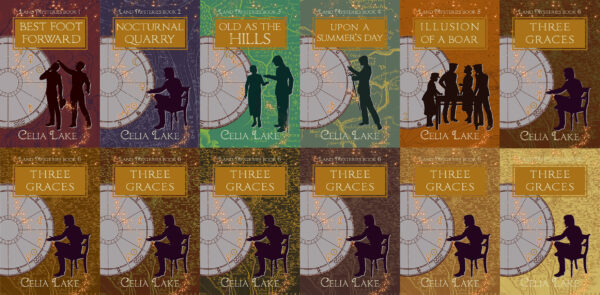
One trick with covers in a series is getting enough differentiation between them! In the 1920s books this isn’t too hard because the covers involve at least two colours. Here, with one main background colour (and needing the gold of the title and lettering to work), we were a lot more limited!
Here’s the image Augusta sent me when we were talking about different possibilities, so I could see the cover in different variations. Obviously, this was before she’d sorted out the figures, so we have a lot of Alexander gesturing as a model. In the end we went for the deep brown, as a nod to the land magic, and because it was hard to find a gold that went well next to Illusion of the Boar.
The Magic of Four
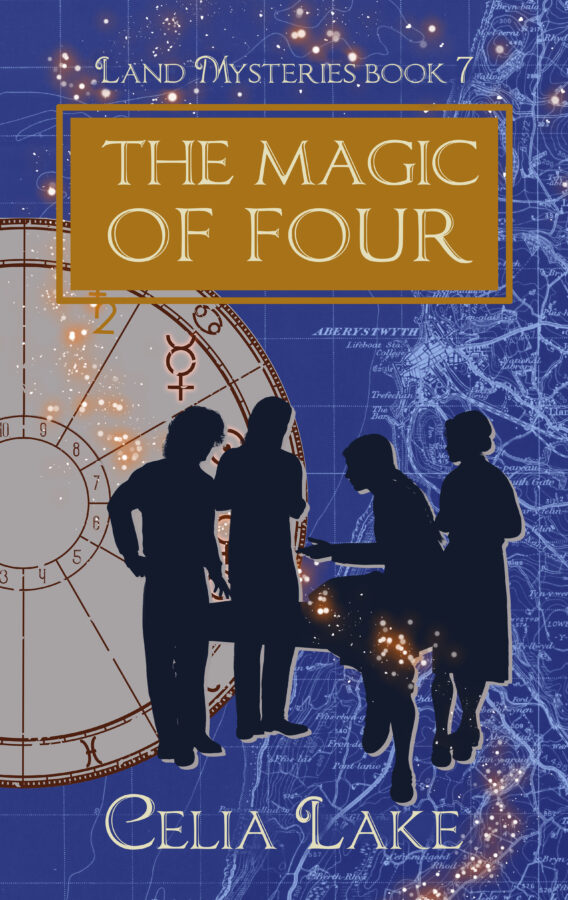
Last book! The Magic of Four is a school story, with four point of view characters. Here, Augusta’s question when she was doing the figures was “Which of them’s sitting on the table?” That’s Avigail, of course. The others are Leo, Jasper, and Ros just behind Avigail.
I knew from the beginning of planning the series that I wanted the cover to be blue. That’s both for the island location with ocean all around, and for Leo (who begins and ends the book in sequence) and the values of Bear House.
Time and place
The map for this one was trickier, because while the island Schola is on existed historically, not on any useful maps, and it hasn’t existed for centuries or millennia. Here, we’ve got the coast of Wales, extending into Cardigan Bay. Schola is properly somewhere under the chart, then there’s more ocean.
The date is the date of the last major event of the book, June 6th, 1947, which has to do with the secret societies. I looked at the chart for their big adventure, but it had no planets that would appear on the front cover, and that’s boring.
What do you think?
Let me know if you have questions through the contact form, replying to any of my newsletters, or chatting on Discord!
