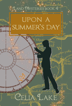
I absolutely adore my covers. Augusta Scarlett does a fantastic job figuring out how to come up with something that fits the genre, the historical period, and the feel of the book. Welcome to the first of three upcoming posts about our cover design, focusing on the Mysterious Arts covers.
Later this summer, we’ll have one about the Land Mysteries series. And finally, we’ll have a post about the covers for the Mysterious Fields trilogy. We’re starting with Mysterious Arts because they’re the simplest to talk about in several ways.
I’ve put the cover images in at Large size to make it easier to look at the details. Depending on your reading habits for this blog, opening them in a new tab might be easier.
Cover design in a nutshell
Cover design is a complicated topic, with a lot of moving parts. Complicated enough that I did an entire (public) post on Patreon about the background of what goes into cover design. I won’t repeat myself here!
Long story short, a cover has to do a lot of work to indicate what sort of book you can expect. I have made things particularly tricky because there’s not a lot of stock art for the 1920s (especially if you want anything other than flappers and gangsters, or if you want a range of body types, etc.).
Fortunately, Augusta had the brilliant idea to use a 3D modelling tool to create people, turn them into silhouettes, and then use that as the basis for the covers. It gives us a much broader range of people, clothing, and positions than we could otherwise get.
We’ve been doing this for a while, so Augusta has picked up a nice range of assets for the program like 1920s shoes. (Every so often when something goes on sale, I get an email of “Are you likely to have a character who’d wear these sometime?”)
As noted in the Patreon post, for every book I send Augusta a cover brief with information. This includes the series (which determines the layout of the cover), title, characters, colours, and symbols or other images that might be relevant. On to the specific books here!
The Mysterious Arts Covers
The Mysterious Arts series focuses on various arts and crafts. (This shouldn’t be a surprise to anyone, right?)
That meant that we wanted covers that could bring make that front and centre. In this series of covers, we’re doing that with the item inset in the top right. But it’s also about how the two characters are interacting on the cover. There’s more direct interaction in these covers than in some of the previous ones, both of them focused on some object relevant to the art form.
The other consideration here is that we wanted them to fit with the other 1920s books (The Mysterious Charm and Mysterious Powers series, at this point.) These books all have a similar layout. Two figures take up much of the cover, with the text around them. An item’s inset into one corner (right on the first and third series, left on the second). And they’re framed by a suitable period frame.
One of the things we adjust is to look at the hem lines and other clothing details (as relevant for silhouette). Obviously there’s also some character variation here.
Lynet, for example, does not have an expansive clothing budget, she’s not doing dressing to suit current fashion. (Also, there’s a war on and she has other things to think about). Charlotte, daughter of a landed estate, absolutely pays attention to the details, though in this case she’s dressed more informally. The clothing she’s in is what she was wearing on a spring afternoon.
Bound for Perdition Cover
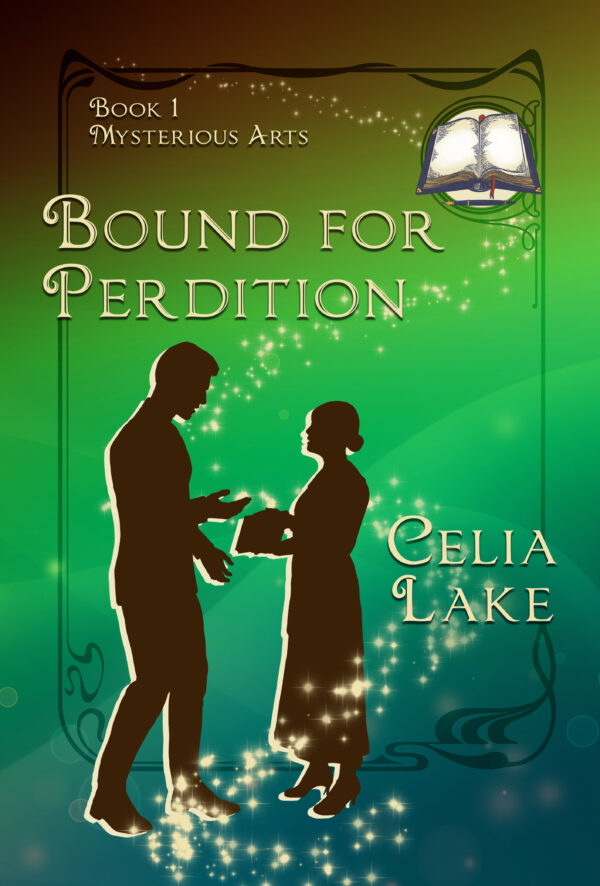
Bound for Perdition is about Lynet, a bookbinder, and the creation of Albion’s magical journals in 1917. Obviously we wanted books to feature on the cover. They’re blank, to start, which is why that book inset doesn’t have any words on it.
For colours: we wanted shades that evoked both books and the fact that one of the pieces of the plot has to do with land magic. (Or consequences for the land, in the longer-term.) That made the brown and green shades rather compelling, and the fact they shade into a slightly too bright green, the kind that makes you wonder if something’s gone a little astray. Someone’s trying too hard.
Positioning: As I mentioned above, these covers so far all have the two figures interacting directly with an object. Here, Lynet is holding a book, one of the journals. Reggie’s talking to her, trying to understand it. If you look closely, you’ll also realise that he’s not putting as much weight on his bad foot, the reason he got invalided out of the Army.
Other features: One of the ways to signal “this is a fantasy book” is to add graphic effects that look sparkly and magical. For the 1920s books, we go with a swoosh of starry goodness. It’s the same one on each book in the series, to help keep the covers looking uniform.
That’s also true with the framing. The colours change to suit the cover, but it’s the same frame on every book.
Shoemaker’s Wife Cover
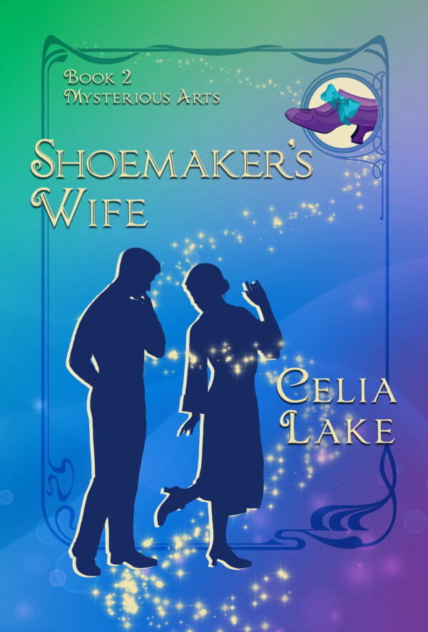
Shoemaker’s Wife is a “We got married fast during the War and now we’ve got to figure out being married” romance taking place in 1917. Owen was a shoemaker before the War, and during the book finds a job working backstage at a theatre. Clara, his wife, works in her aunt’s apothecary shop (running the shop part).
For colours: When I wrote this book, I hadn’t intended for colours to have a big role. However, that changed over the course of the book. That bright purple in the bottom right is relevant at one point, and Clara makes a point of liking highly saturated brighter shades in her clothing when she has an option.
(I know, I should have predicted the colours. I do like my colours in writing, rather a lot. People noticing colours, people talking about colour, people wearing them or choosing them.)
Positioning: Owen is a shoemaker. The title of this book comes from an old proverb, about the shoemaker’s children (or wife) going barefoot because he’s too busy doing work for other people. Here, Clara’s trying on a shoe he made.
Inset: And just as obviously, there’s a shoe in the inset, in that vibrant purple. We styled this one based on extant shoes (and the ribbon bows for lacing allowed people to change out the lacing more easily and mix up the design aspects). Having a shoe in this sort of colour is also a sign that you have other shoes for when you need something a bit more ordinary, like brown or black or navy.
Perfect Accord Cover
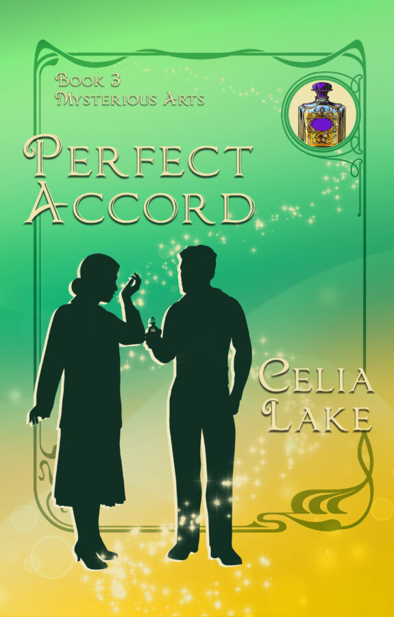
In Perfect Accord, Charlotte ends up in a remote country estate in 1923. She stumbles into where Lewis, an alchemical perfumer, is working.
For colours: This book mostly takes place in the last two weeks of April, running up to May Day. I wanted the greens here for the greening of the world that comes at that time of year in England and other similar climates.
In my notes to Augusta on this one, I said : “Open to a range here – one of the secondary characters is prone to Dramatic Red (but she should probably not get to muscle herself onto the cover). Happy plant greens (more on the muted side than Bound for Perdition) might be interesting, given the series so far (and it takes place in the fortnight before May Day) or gold.”
Positioning: We absolutely wanted to get the perfume on the cover, and this comes from a specific scene where Lewis has made something specifically for Charlotte. She’s applied it to the pulse point on her wrist and is smelling it. You can tell by how she’s holding her hand she knows how to test perfume sensibly.
Inset: The bottle on the inset is a perfume bottle, of course. It’s got purple as a nod to the fact Charlotte is absolutely suited to Fox House. There’s more than a little ambitious plotting going on here, though not all of it comes out as people expected.
Facets of the Bench Cover
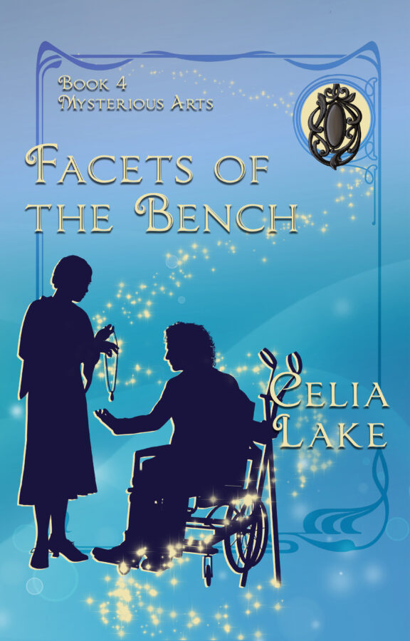
Facets of the Bench will be out in August of 2024. (So about five weeks from when this post goes public). It takes place in 1927. Griffin is an ambulatory wheelchair user, and I absolutely wanted to make that visible on the cover. Annice is a jet carver and jewellery maker.
For colours: The first half of the book or so takes place in Whitby, on the Yorkshire coast. I wanted something that would both evoke the ocean and contrast well with a jet inset, so we went with the shades of blue you see here.
Positioning: This is where our current approach really comes into its own. Augusta took an existing wheelchair asset, set up a figure for Griffin, and then figured out how to get the right sort of forearm crutches for the period into the image. (Griffin sometimes also uses canes, but I thought those would be less clear on the cover, especially at smaller sizes.)
Annice is wearing a shawl, and holding out a jet necklace for him to look at. The inset includes another jet piece, with the sort of delicate carving that makes me certain magic was used to keep it from breaking. (Jet can be fragile if dropped accidentally.)
There we go! Four covers. I’ll be back in a few weeks with the Land Mysteries covers where we took a different approach. (And where there are a number of details that aren’t obvious unless you know what to look for!)
